
Many new and established business owners believe that their brand identity is a name and a quick logo made on many of today’s free design websites. To be effective, brand identity is more than just its basic name and logo on a business card.
Yet, it’s also true that that a name and business logo are key connectors for a brand, so it is very important that both be strong and unique.
Your company’s current brand identity is the collection of the experiences with current customers and future clients. A great brand can communicate what it does and how it does it efficiently and with ease. A unique brand identity can also establish trust and credibility quickly with your future customers thanks to its loyalty and visibility. Because a company and brand message evolves over time, many companies, including some of the most iconic ones, rebrand to maintain a personal connection with existing customers but also to develop a level of understanding with it’s future customers.
Reasons to rebrand
It is important to understand how customers relate to your brand identity but also how you feel you connect with your market. Some iconic brands have changed their identity for the better and some have changed it for the worse.
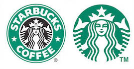
In 2011 Starbucks followed in the footsteps of other great iconic brands by removing their name from their logo. Sports companies such as Nike & Adidas lead the way in iconic branding without the need for their names to be included in their logo.
Starbucks Green is included in most of the company’s materials in a way that never feels out of place. You should aim for this when creating your brand’s color palette. A strong foundation of colour for your brand is essential for brand recognition.
One look at Starbucks’ messages, and it is clear the brand is all about taking a moment out of your day to relax and enjoy its quality drinks or snacks.
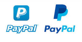
In 2014, PayPal had already been around for 16 years when they decided it was time for a change and to rebrand. Thier new logo was formed as part of their identity to focus on a “People Powered” economy. This rebrand was such a success and customer loyalty has undoubtably increased since the decision to rebrand was made.
“PayPal’s blue color palette has very strong brand recognition,” Alison Sagar, VP of Marketing at PayPal UK adds, so they didn’t want to change that too radically. “But we’ve made those colors more vibrant so that they really pop out more effectively,” she says.
Sometimes the phrase “if it ain’t broke, don’t fix it” should also be considered.
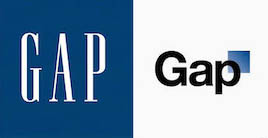
In 2010 GAP spent $100million creating a new logo. They released this logo with no warning, no marketing plan or social media drive.
It took the public unawares and was not communicated effectively, creating an element of unease with GAP’s current brand loyalty. There was just too much change and very little connection left with it’s historic brand identity. This caused one of the fastest turnarounds in branding history and the new logo was reverted back to the original format after only 6 days.
Your Brand
Listening to these case studies should make you more aware of just how important your brand identity really is. A logo from a free site or made quickly with no consideration or historic study has no unique identity. Another company with different values to you but using the same logo will also be both confusing and diluting to your message. Remember when starting a new company or refreshing an established brand you must put the message and how it is used at the top of your list, as that is where you want to be with your customers decision making.